This apartment of Mr. Patel is nothing more than an attempt to make the space look modern as well as spacious following a minimalism concept overall. Fulfilling the clients” requirement as well as making the space look beautiful was our utmost priority being interior designers.
On having a glance to the exterior of the apartment, being compact a simple and minimal design was created for it having a geometric pattern safety grill as well as smartly designed name plate. The colour theme selected here is in the shades of grey which continues inside the living area, dining area as well as the kitchen.
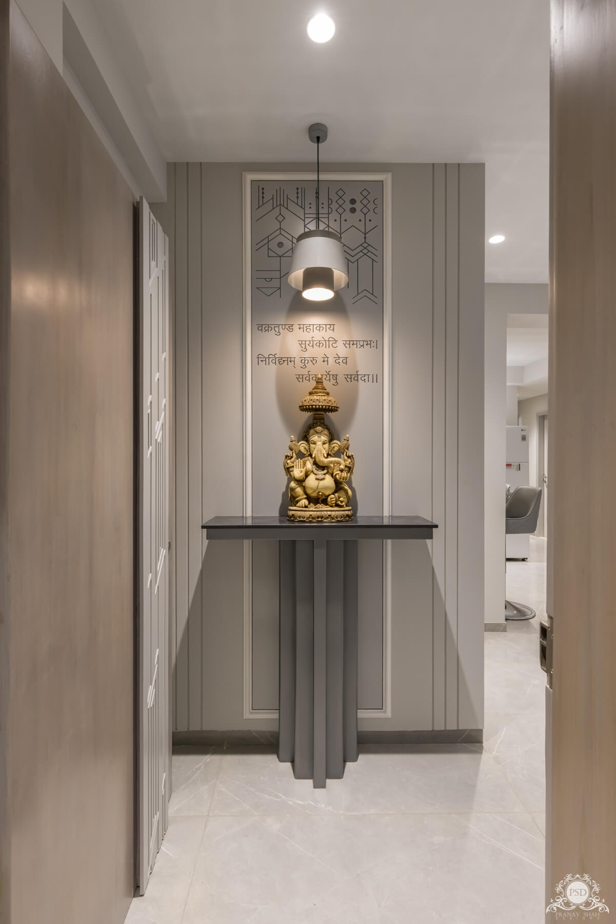
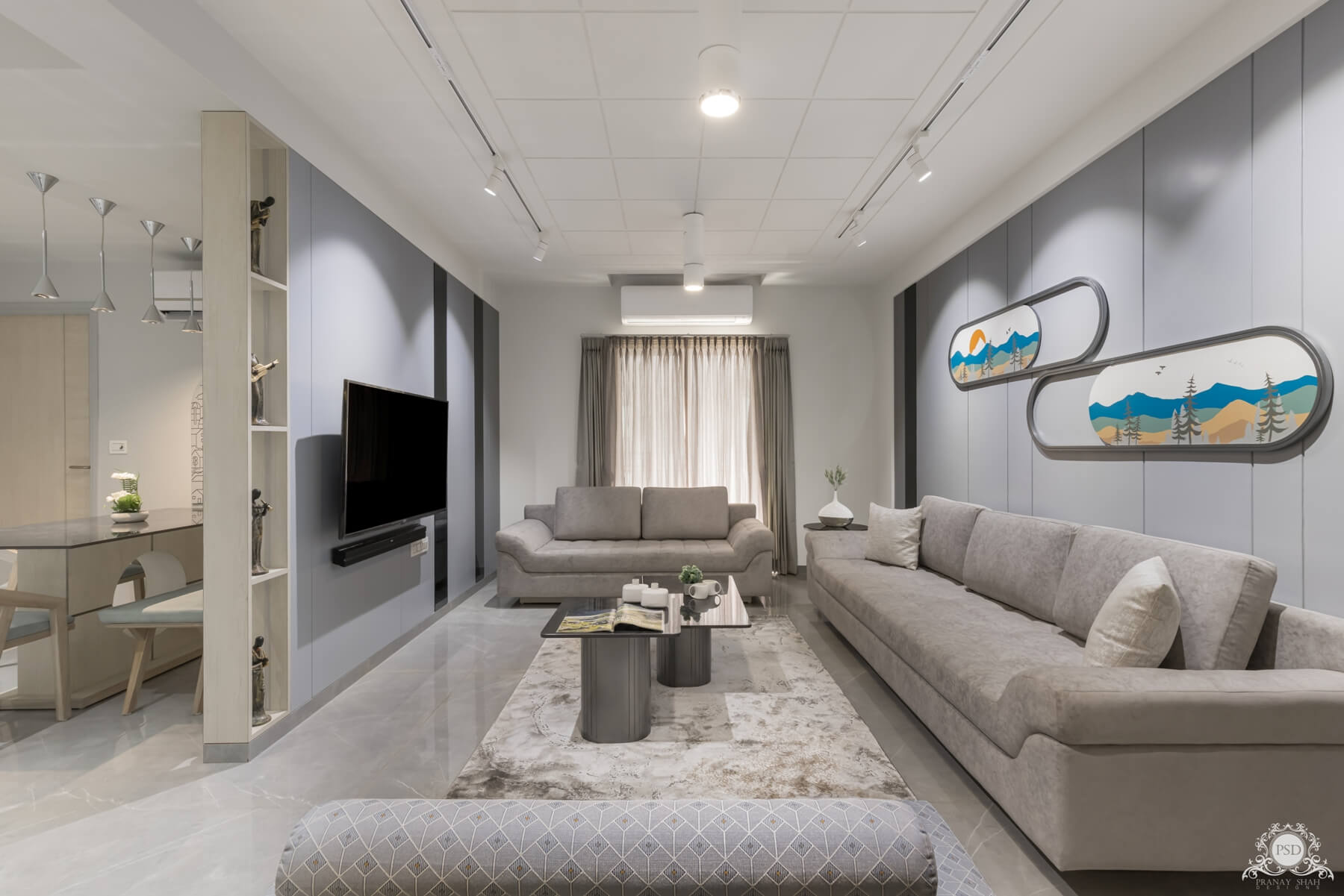
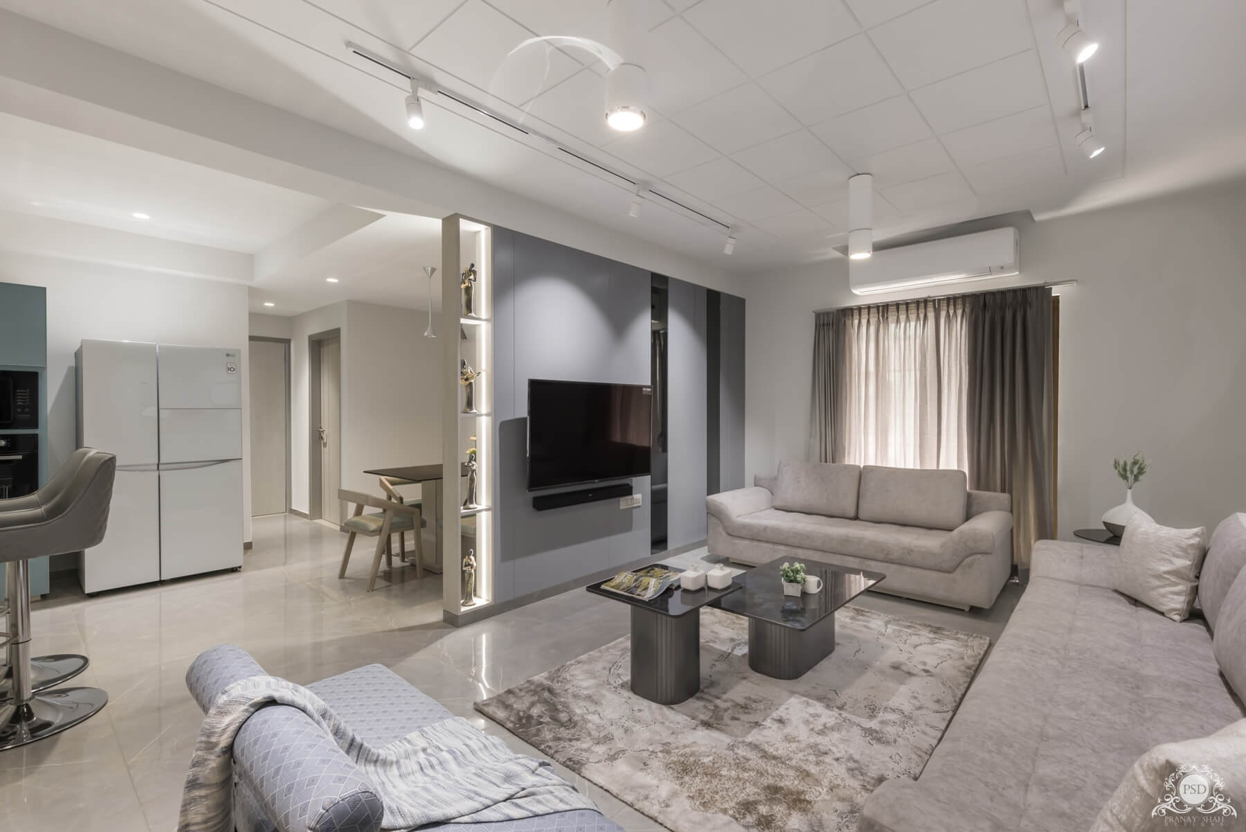
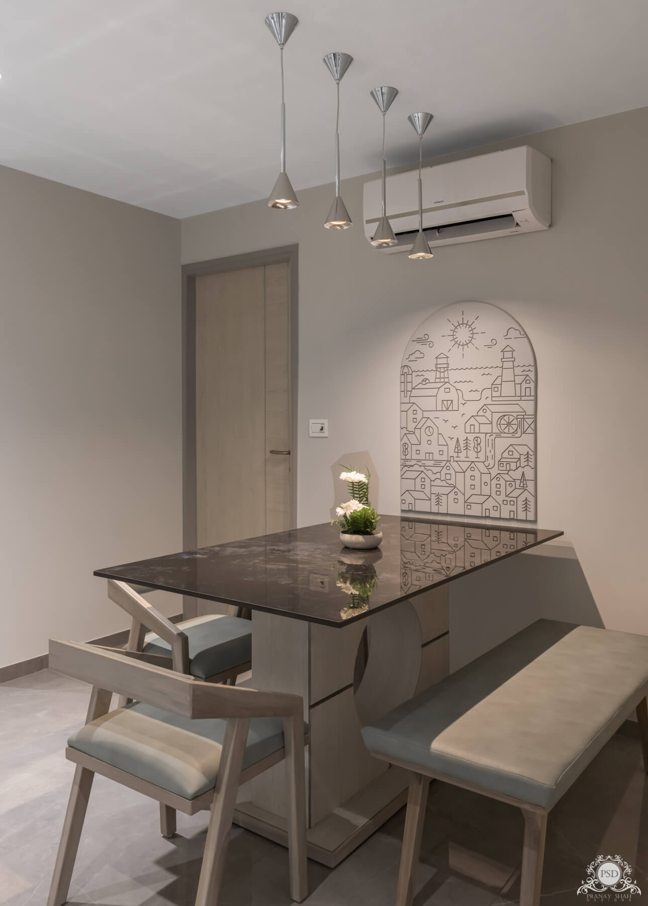
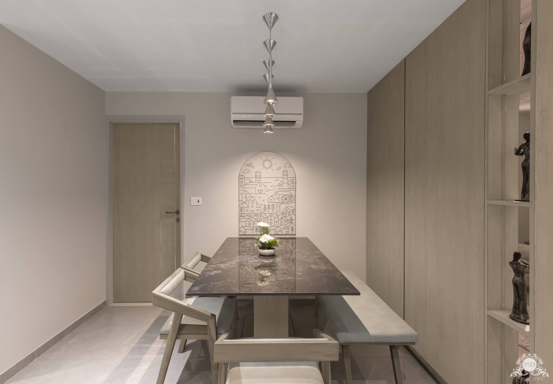
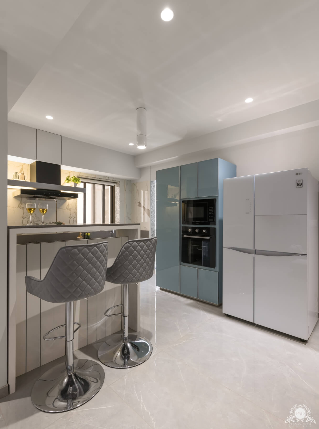
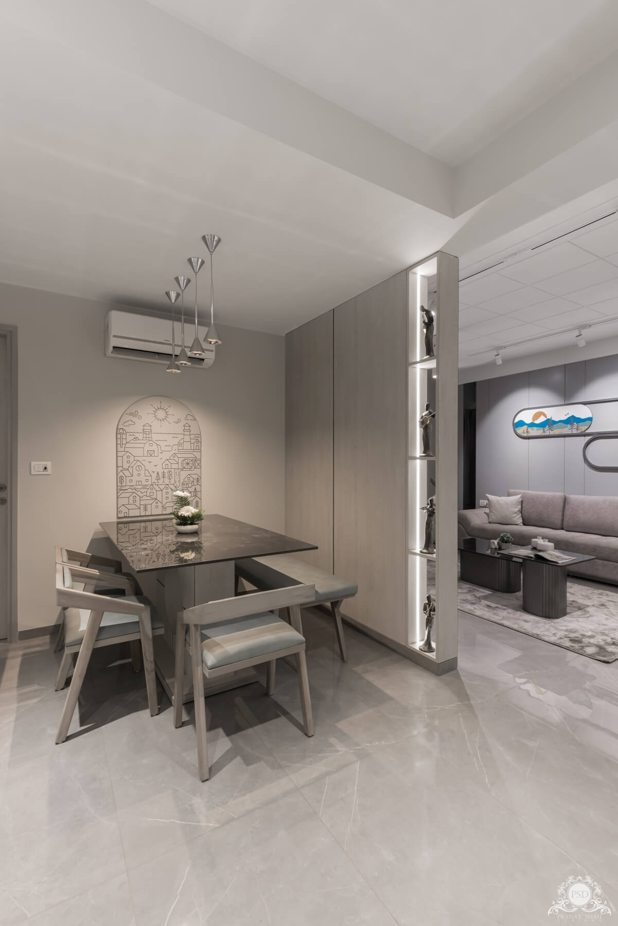
A foyer is visualized as we enter the house which is aesthetically designed having a mantra at the back side with a few geometrical patterns. A beautiful console design was created in the foyer itself for placing an idol of god which seemed as a 3D product. Further on having a glance on the living area, it perfectly looks lavish. The grey hues are smartly blended and selected for this area which makes everything seem soothing. The wall behind the couch is designed with random patterns having coloured glass placed randomly. The wall art on the same wall depicting beautiful scenery adds more colour and beauty to the wall. The TV unit is a kind of replica of the wall talked about previously in which shelves are added to add some elements to the area. The dining area looks absolutely gratifying as the wall art against the dining gives a completely unique look to the area. The multiple hangings above the dining give a calm ambience to the space. The kitchen area is designed in a hue of blue which goes more towards greyish creating a theme that completely blends with the overall theme of the space.
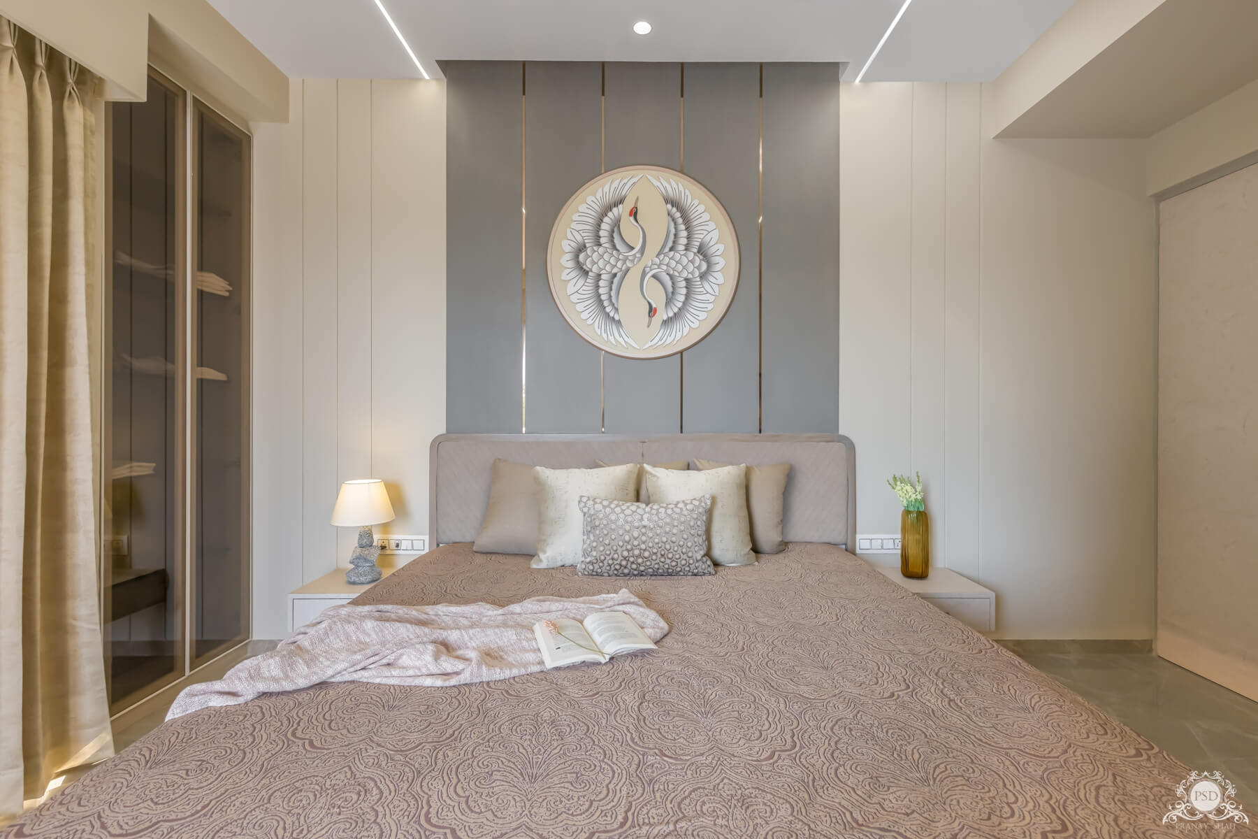
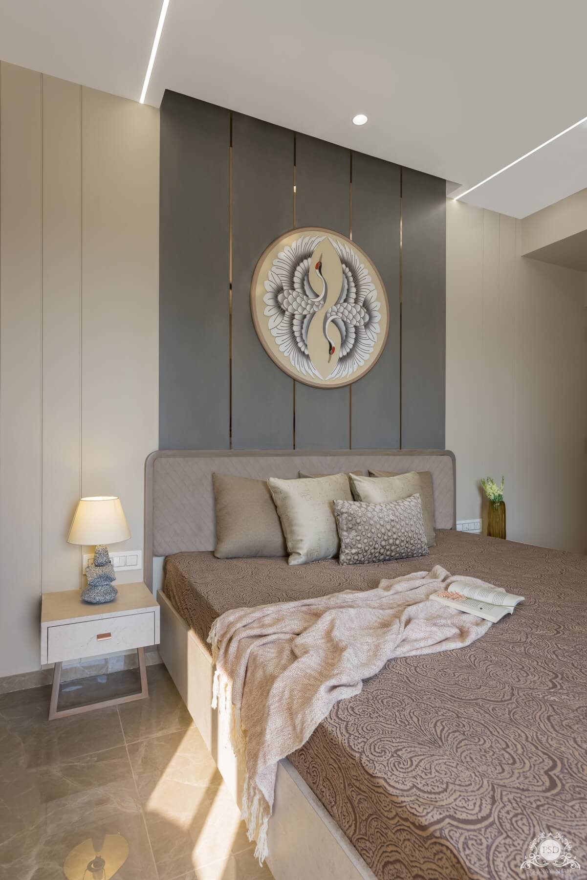
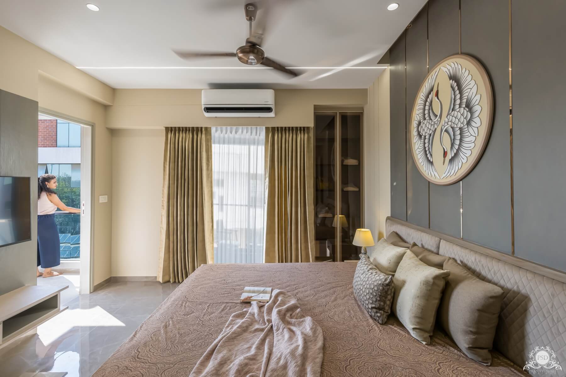
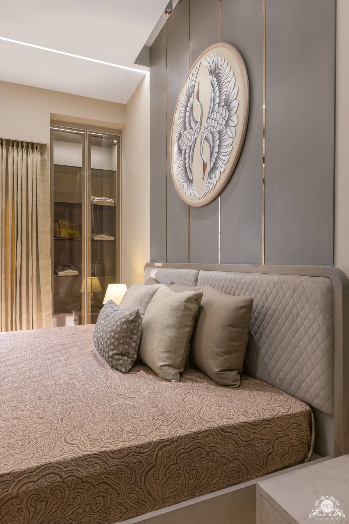
The master bedroom is designed keeping the theme royal as well as modern. Everything seems quiet luxurious which makes the space seem glamorous. A calm background is given to the bed wall with a solid royal colour adding brass finish elements to it on which a magnificent wall art is designed that lifts up the room in terms of beauty. An elegant vertical storage is provided in a niche of the room besides the bed that brings a dignity to the space. The wardrobe of the space is designed simply by our interior designers giving it calm tones. The flooring here is specifically chosen keeping the theme of the space in mind being as Italian finish.
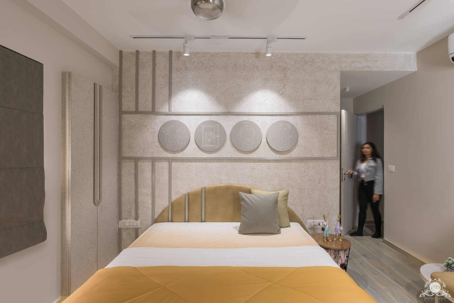
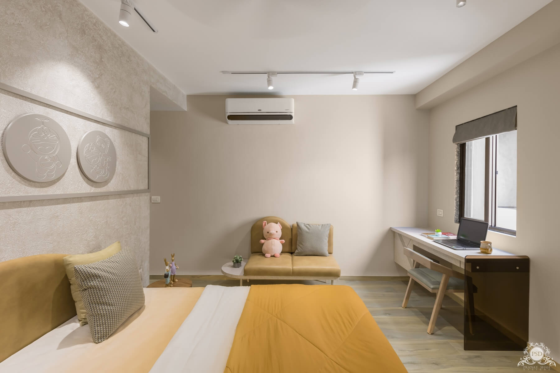
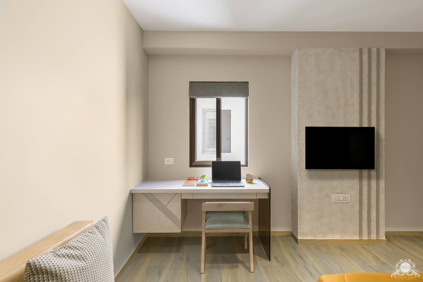
The kid's room here is designed in a rustic theme depicting playfulness. The wall behind the bed has an enchanting pistachio coloured texture with teak borders creating a pattern on the wall that also continues in the back rest of the bed. Being a kid's room the Doremon wall arts were designed for this space giving it a single colour that makes it look classy. The room had two niches in one of the walls besides the window. Those niches were used as designing closets in it for the kid keeping the colour palate calm and light so that it doesn't seem as a hurdle to the viewer. A small study table was also designed in one corner of the space with a designer seating that looks quiet smart. The hues of the room are quiet vibrant that makes the room more colourful and decent at the same time. The flooring of the space is chosen in a wooden theme with colours from the same colour palate of the room.
The whole project was completely with great ease satisfying every need of the client.


